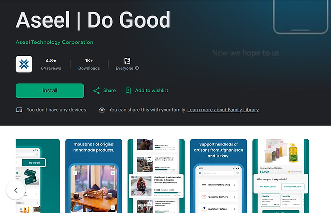
Aseel
An award winning artesenal e-commerce platform for humanitarian relief aid in Afghanistan
Background
Client: Aseel
Role: UX/UI Designer & Digital Strategist
Timeline: [Insert Timeframe]
Tools Used: Figma, Miro, Google Analytics, Hotjar, WordPress
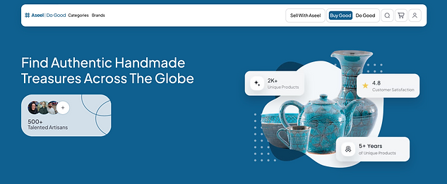
Working with Aseel: Do Good Buy Good
Creating a New Web Structure and Buying Ethos for a Million Customers
Role: UX / UI Designer Skills: User Experience, Wireframing, Competitive Analysis Time: 2022
What’s the opportunity?
Aseel decided that upon its slogan Do Good Buy Good they would enhance the channels of user attention and buying resources in the process of order to offer their customers a way to save on time in buying artesanal items by merging the two website sects, Buy Good + Do Good. Customers find themselves attracted to the holistic and humanistic approach and slogan driven by the tagline Buy Good Do Good. The trick was to bring the bring a seamless experience withholding the meaninging and ethos of the slogan in an engaging manner.
Aseel Rakuten, Honey, Capital One Rewards, etc., and it was important to do everything under one umbrella since customers already come to the store.
Situation & background
We on the design team needed to conduct a design workshop to understand the best, most UX friendly reward system. We wanted to know how to make Rewards clear, how to come up with a unified nomenclature, new UI components to demonstrate Rewards, ways to make it easy for customer to claim rewards, why it operated the way that it did.
Task
According to analytics performed by Aseel, “There has been a 54% decrease in artesanal purchasing over the last 5 years, while there was an increase in digital coupon transactions by 17% over the last year. Money savings tools drive 12% of customer choice an online offering.”
The task was to :
-
Introduce digital coupons to the Aseel customers by seamlessly offering and integrating it into its purchasing enviornment
-
Design a way to combine streamlined pathways for exploring with offerings with Aseel digital / in-store experiences.
-
Create the full ecosystem for this new Rewards functionality including Rewards UI components, various states, interactions, etc.
-
Increase digital coupon redemption while learning about what the customers are buying and whether Rewards were motivating specific purchases over other
Creating a New Web Structure and Buying Ethos for a Million Customers
❓ Problem
Despite the impactful and loyal following to the powerful ethos, Aseel's split interface between the “Buy Good” and “Do Good” platforms led to:
-
User drop-off between the two experiences
-
Low cross-engagement across the two pillars
-
Redundant content, causing navigation fatigue
-
Missed opportunities to tell a cohesive brand story and encourage mutual support (e.g., customers shopping and donating)

Objective
Create a unified, intuitive experience that bridges Aseel’s ecommerce and humanitarian platforms—seamlessly integrating commerce and compassion.

My Process
1. Stakeholder Alignment & Research Framing
To set a strong foundation, I began with discovery interviews with cross-functional internal teams—product managers, engineers, designers, and outreach specialists. These conversations surfaced shared objectives, clarified constraints, and illuminated team-wide desires to create a more emotionally resonant, action-driven platform.
Key outcomes:
-
Aligning on the goal of increasing cross-engagement between the “Buy Good” and “Do Good” sections
-
Emphasizing the shared values of Aseel’s audiences (empathy, action, support for vulnerable communities)
-
Highlighting the need to simplify user journeys while preserving both commerce and aid functionalities
These interviews also helped frame our user research plan, revealing key assumptions we needed to test through user interviews and behavioral observation.
2. User Research & Journey Mapping
I conducted in-depth, semi-structured user interviews with both donors and shoppers (often the same individuals) of about 20 individuals across several regions.
The questions posed aimed to retrieve the following content and arenas of thought from users and donors
-
User motivations and expectations: What inspires a user to donate versus shop?
-
Mental models and pain points: How do users interpret the site architecture? What causes confusion or drop-off?
-
Emotional journeys: What feelings and beliefs are driving actions?
Insights revealed:
-
A strong overlap in user values between shoppers and donors, despite being routed into separate funnels
-
Frustration with navigating between impact and product pathways
-
A desire for a cohesive narrative that explains how all actions support the same mission
In parallel, I ran a heuristic evaluation of the current site and analyzed behavioral patterns using Hotjar heatmaps, user session recordings, and analytics data. I mapped two primary personas—impact-driven shoppers and urgency-driven donors—and sketched out existing and ideal journey maps to spotlight friction points.
3. Design Strategy & Concept Development
Based on both qualitative and quantitative findings, I proposed a strategic overhaul of the homepage and global navigation. Core recommendations included:
-
A hybrid landing experience with clear but connected calls to action:
“Support Local Artisans” and “Provide Direct Aid”
-
A modular homepage structure optimized for storytelling and emotional resonance
-
Design elements to support A/B testing, including toggles between emotion- and action-based content hierarchies
-
These changes were aimed at increasing transparency, boosting engagement, and ensuring that users felt both informed and emotionally connected—no matter their entry point.
4. Prototyping, Testing & Feedback
Using Figma, I will build high-fidelity wireframes and interactive prototypes reflecting the merged experience. I will incorporated:
-
Pathways for users to easily navigate between shopping and giving
-
Real stories and outcomes as modular impact blocks
-
Improved clarity of purpose and microcopy
I will conduct a remote usability testing with returning users and internal stakeholders, to observe how participants responded to the revised flows. I will learn whether feedback will result in improved clarity, increased trust, and a stronger sense of connection to Aseel’s overall mission.